A lighter way to express emotions.
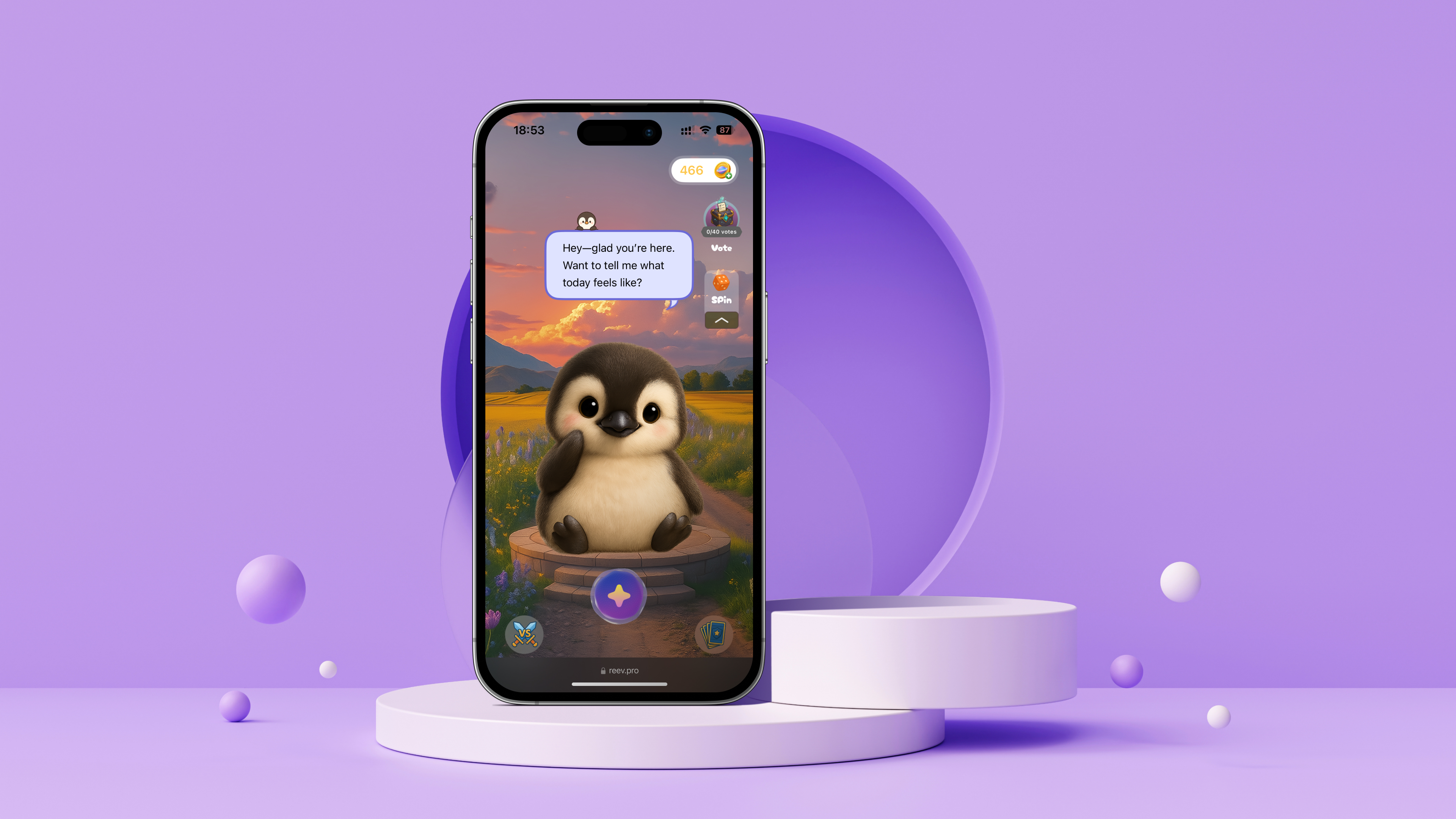
Unimo is an emotional companion app for Gen Z. It offers a lighter, more visual way to express emotions—without heavy journaling or self-labeling.
Most mental health apps rely on closed, text-heavy conversations. They ask users to explain, label, or analyze how they feel. Meanwhile, Gen Z already treats emotions and identity as shareable signals through MBTI types, mood posts, and memes.
This gap created a clear opportunity: move emotional expression out of text-based conversations and into something people can see, feel, and interact with.
Why Users Didn't Stay
Unimo started as a chat-based emotional companion. Early feedback was positive—users described it as cute, comforting, and easy to talk to. But two signals concerned us:
Solution Overview
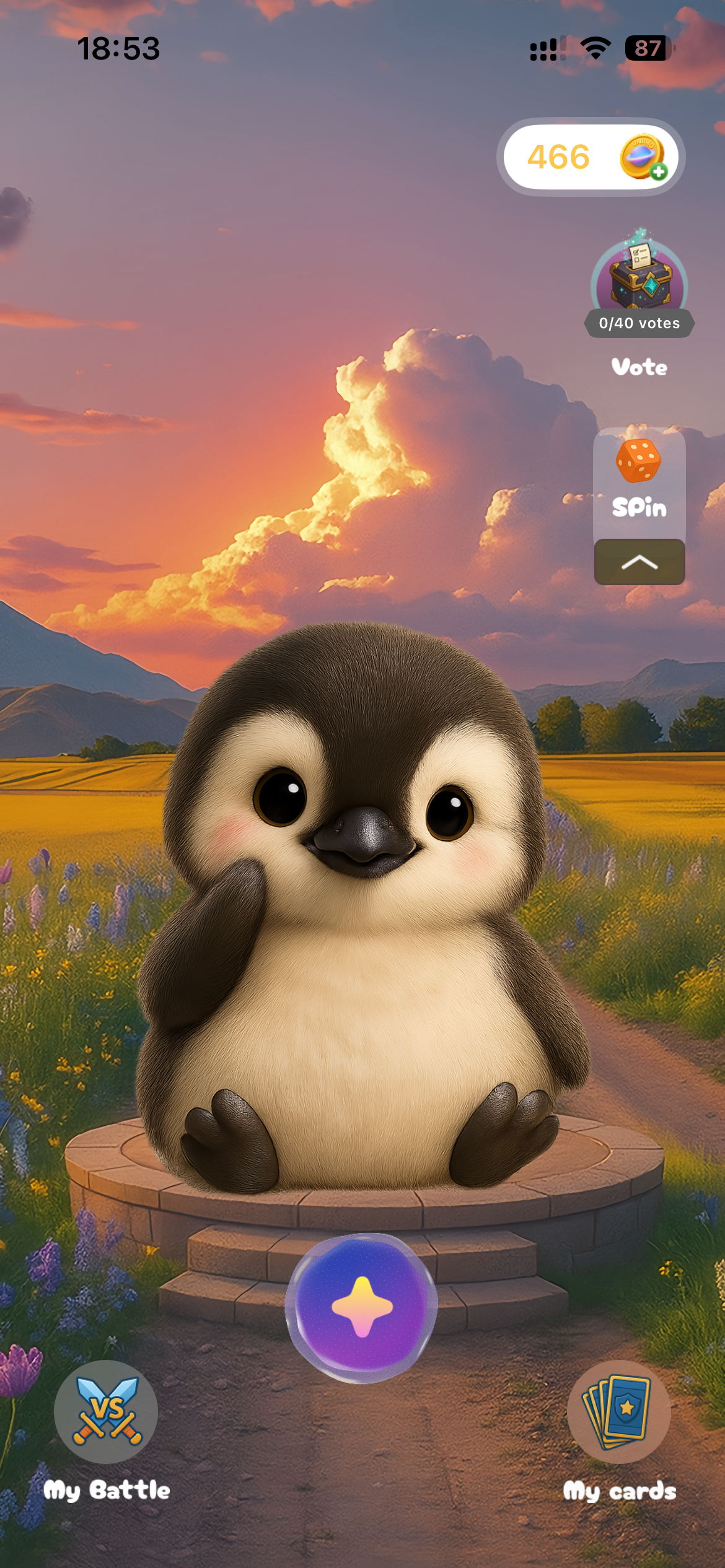
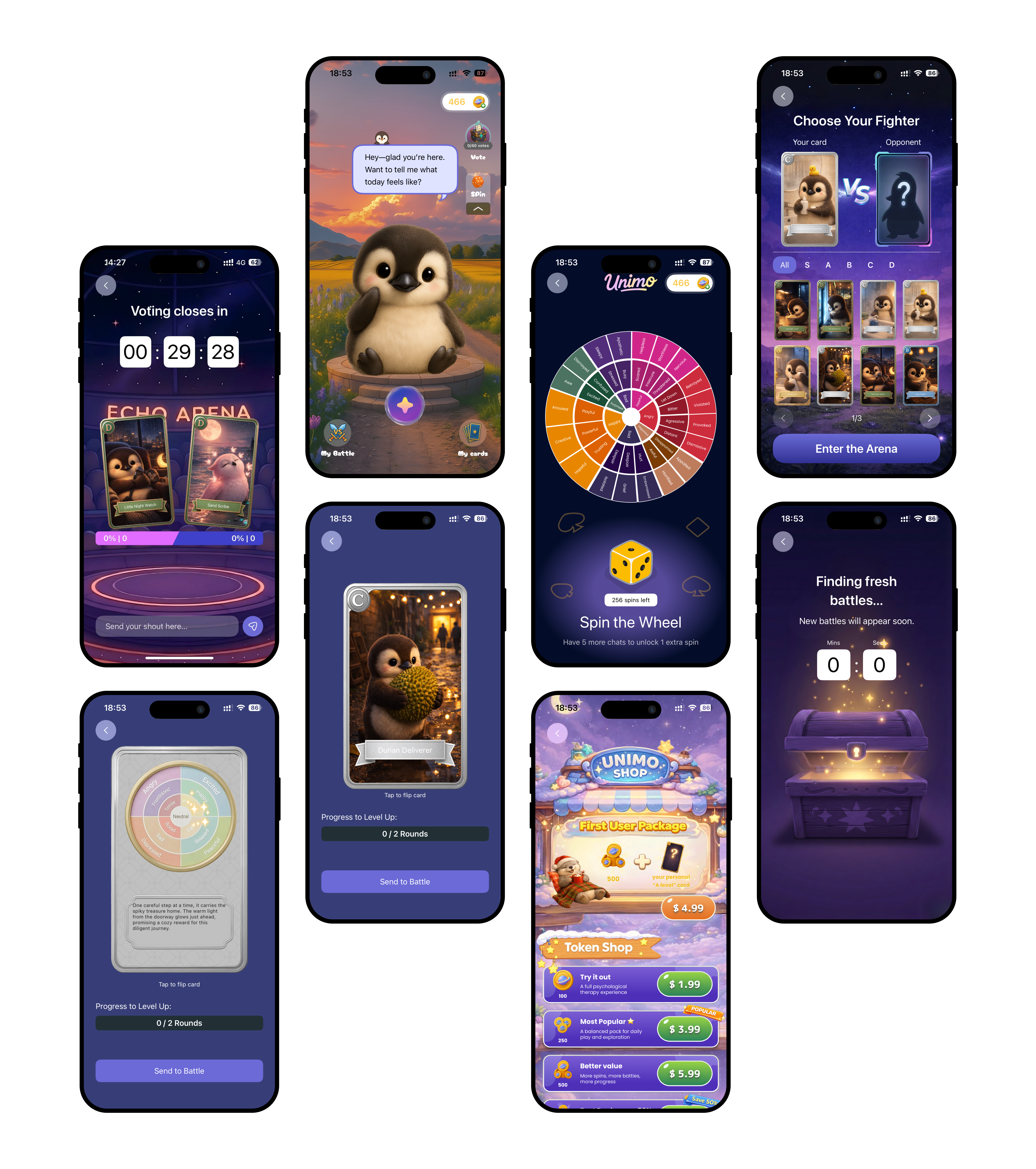
A playful emotional system that turns feelings into visible assets—allowing users to engage, revisit, and resonate without explanation.
Core loop: Interaction → Emotional Cards → Shared Moments → Community Resonance
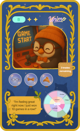
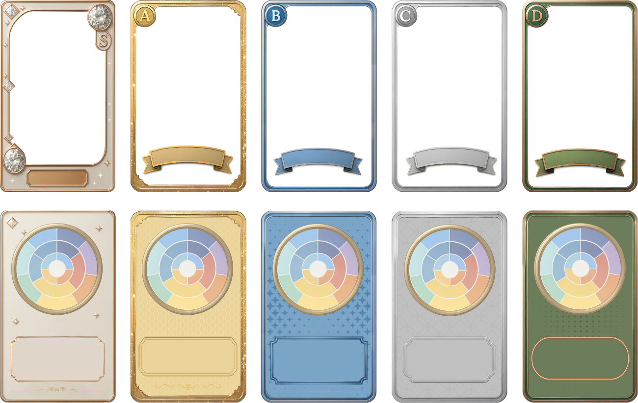
Key Feature 1: Emotional Card Generation
Turning emotional states into visible, collectible assets.
When users chat with Unimo, the conversation is distilled into an emotional card—a visual snapshot that captures what this period feels like. Not a transcript. Not an analysis. Just a trace.
Design Evolution
Iteration 1 – Too clinical. Listed data like a medical report. Users had no desire to collect or share.
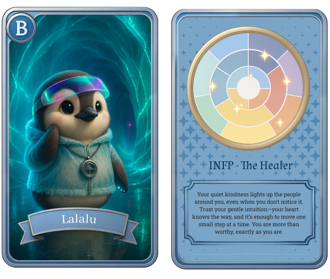
Visual Metaphor First. Transforming emotions into exquisite visual art pieces.
Why this works: Users don't need to explain their feelings. The card becomes a mirror they can look at, save, and return to—without re-living the original conversation.
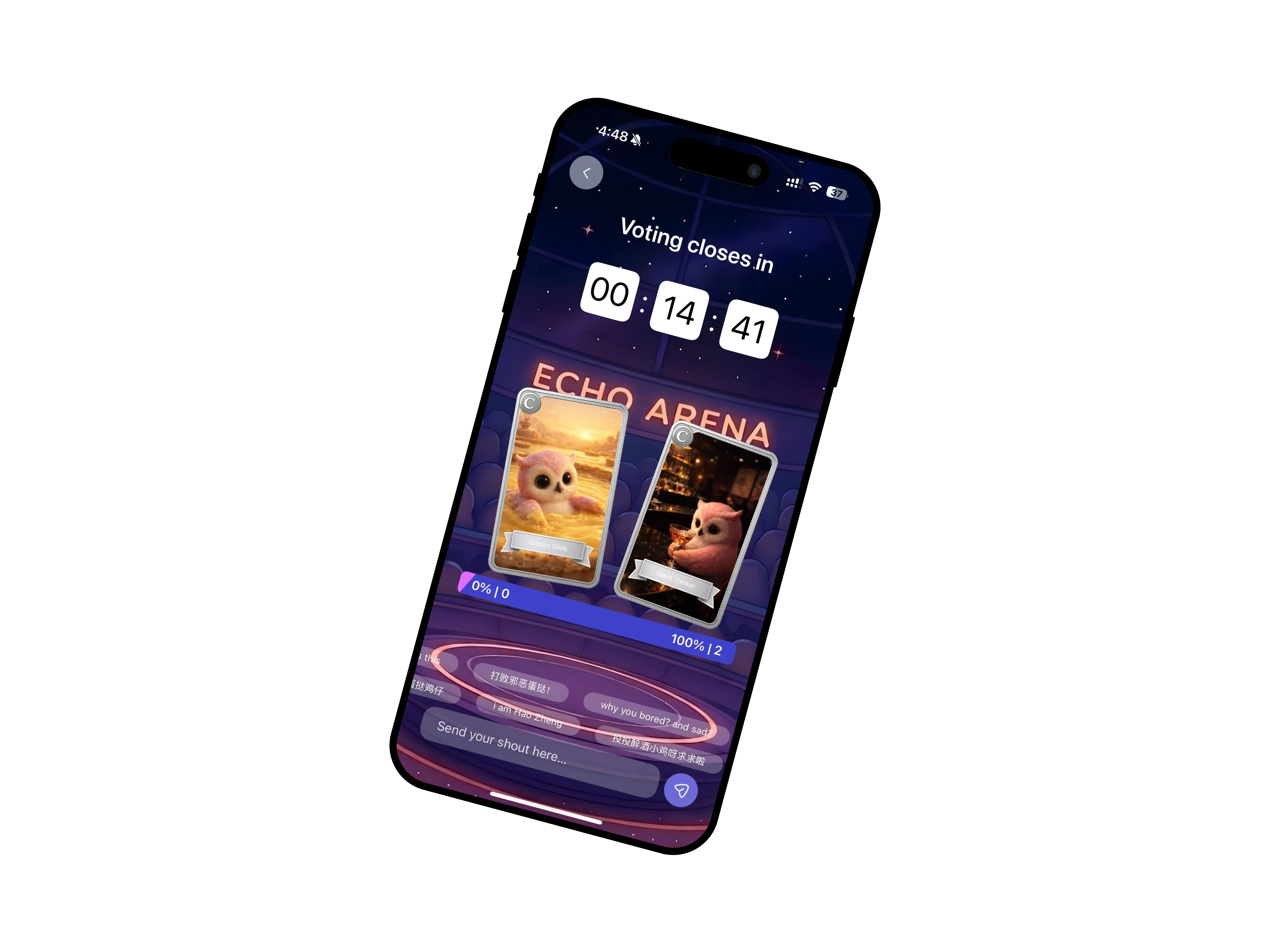
Key Feature 2: Card Interaction & Resonance
Making emotions shareable without over-exposure.
Once users collect cards, they can bring them into lightweight shared spaces. The primary mechanic is Resonance Battle—a misdirection, because it's not a battle at all.
User Flow: See two cards side by side → tap the one that resonates more → receive gentle feedback ("You resonated with this feeling")
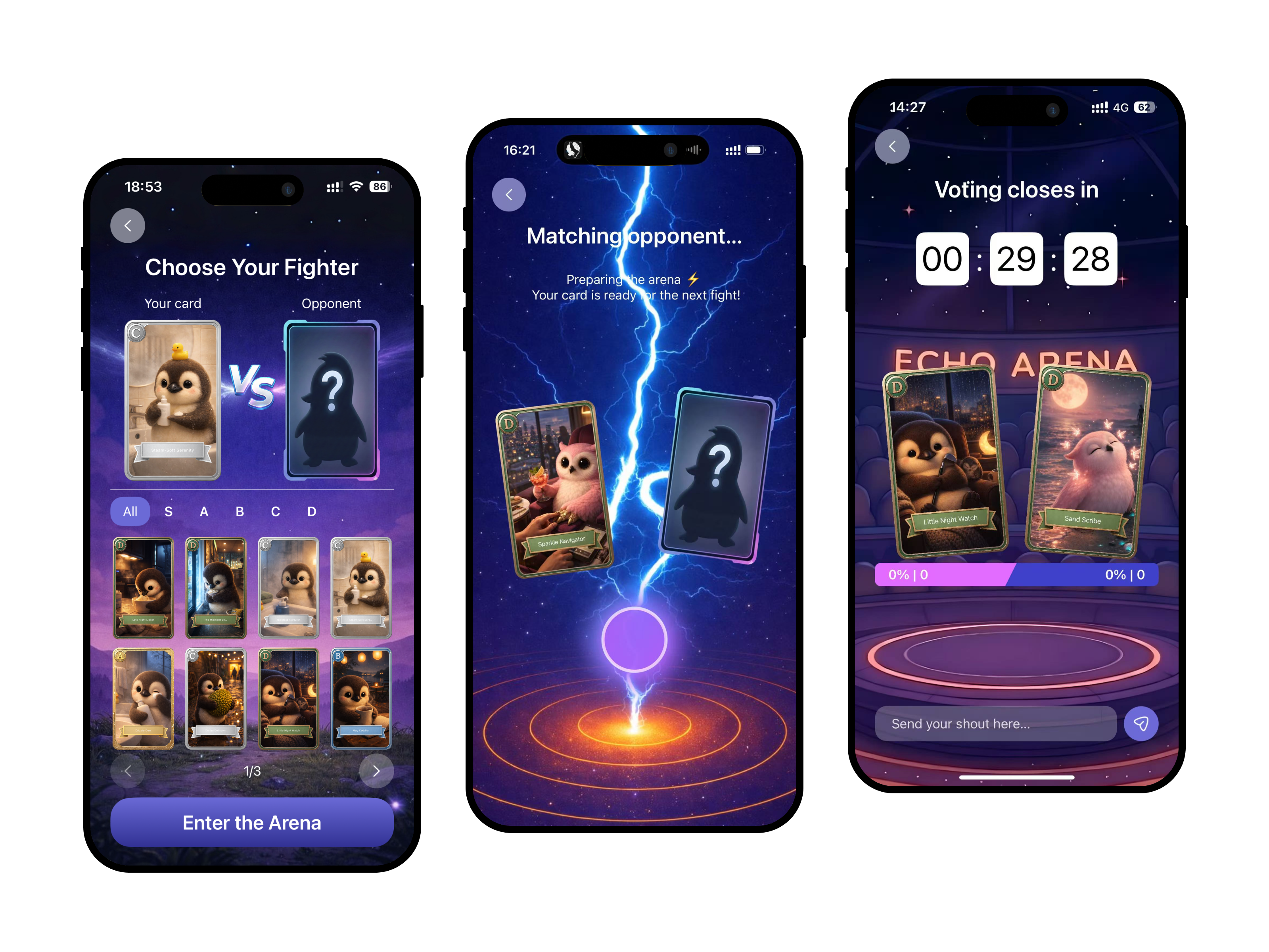
I deliberately avoided competitive language (win/lose, points, rankings). The goal isn't to determine which
emotion is "better"—it's to help users see their feelings reflected in others.
"Not a fight. A mirror."
Key Feature 3: Community Emergence
From individual expression to collective belonging.
Repeated shared moments accumulate into something larger. As users resonate with each other's cards, patterns emerge—not forced by algorithms, but shaped by what people actually feel together.
I designed the community layer around cards rather than conversations for a specific reason: cards are low-stakes. Sharing a card feels safer than sharing a personal story. This psychological safety lowers the barrier to participation and creates a gentler on-ramp to connection.
Early Signals
The product is in early launch stage, so we're not optimizing for scale metrics yet. However, early behavioral signals are encouraging:
Stakeholder Buy-in
The redesigned concept secured leadership approval to pivot from the original chat-only MVP. The team is now fully aligned around the "emotional assets" direction.
Design Principles
- Foster Safety through Lightness & Warmth: Use soft visual language, friendly IP characters, and a non-judgmental tone. The goal is to create an emotionally safe "Unimo World".
- Visual before Verbal: Prioritize visual expression over words. Users should recognize and engage with their emotions without needing to explain them.
- Belonging through Shared Moments: Enable lightweight interactions that create connection without pressure or self-disclosure. Resonance, not competition.