Product Design
BESTMYLIFE
Bridging the Trust Gap for TMS Clinical Research
Redesigned the dashboard interface to improve clinicians’ research efficiency and unlock funding for the next phase.
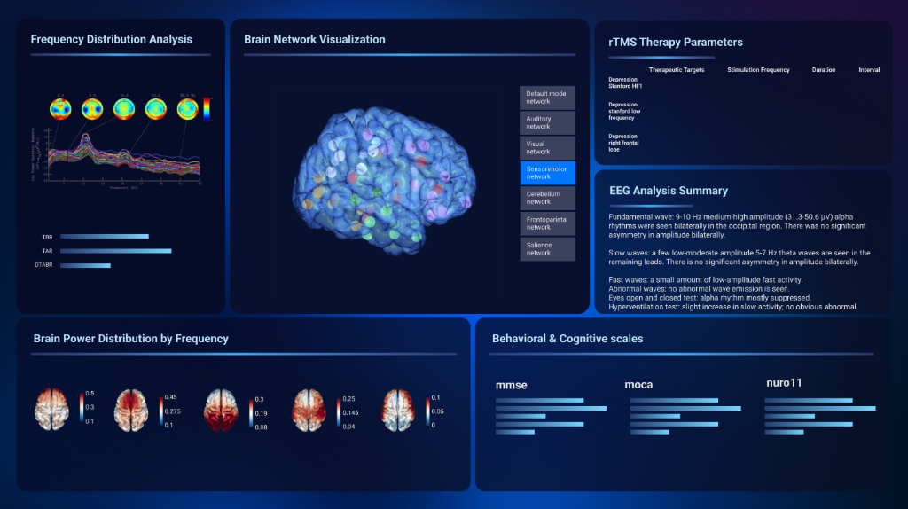

Hey there! I know reviewing case studies can be exhausting. But stick with me — this isn't just another design story. It's about how we took a clinical dashboard that was rejected three times for lacking "credibility" and reframed it into a highly-trusted cockpit system that secured Phase 2 funding.
Role
Product Designer
Timeline
Feb – Mar 2025
5 Weeks
Team
1 PM, 2 Designers
Clinical Experts
Client
Shenzhen People’s Hospital
Stanford Mentors
TL;DR: Bridging the Trust Gap
I redesigned a TMS (Transcranial Magnetic Stimulation) dashboard that had been rejected three times due to a lack of visual credibility. When stakeholders asked for “sci-fi vibes,” I reframed it into a clinical authority system focused on precision, safety cues, and cognitive clarity. The redesign helped the project pass a national clinician vote and secure Phase 2 live-data integration approval.
3×
Rejected in review cycles
5 wks
End-to-end redesign
Phase 2
Approved for live-data
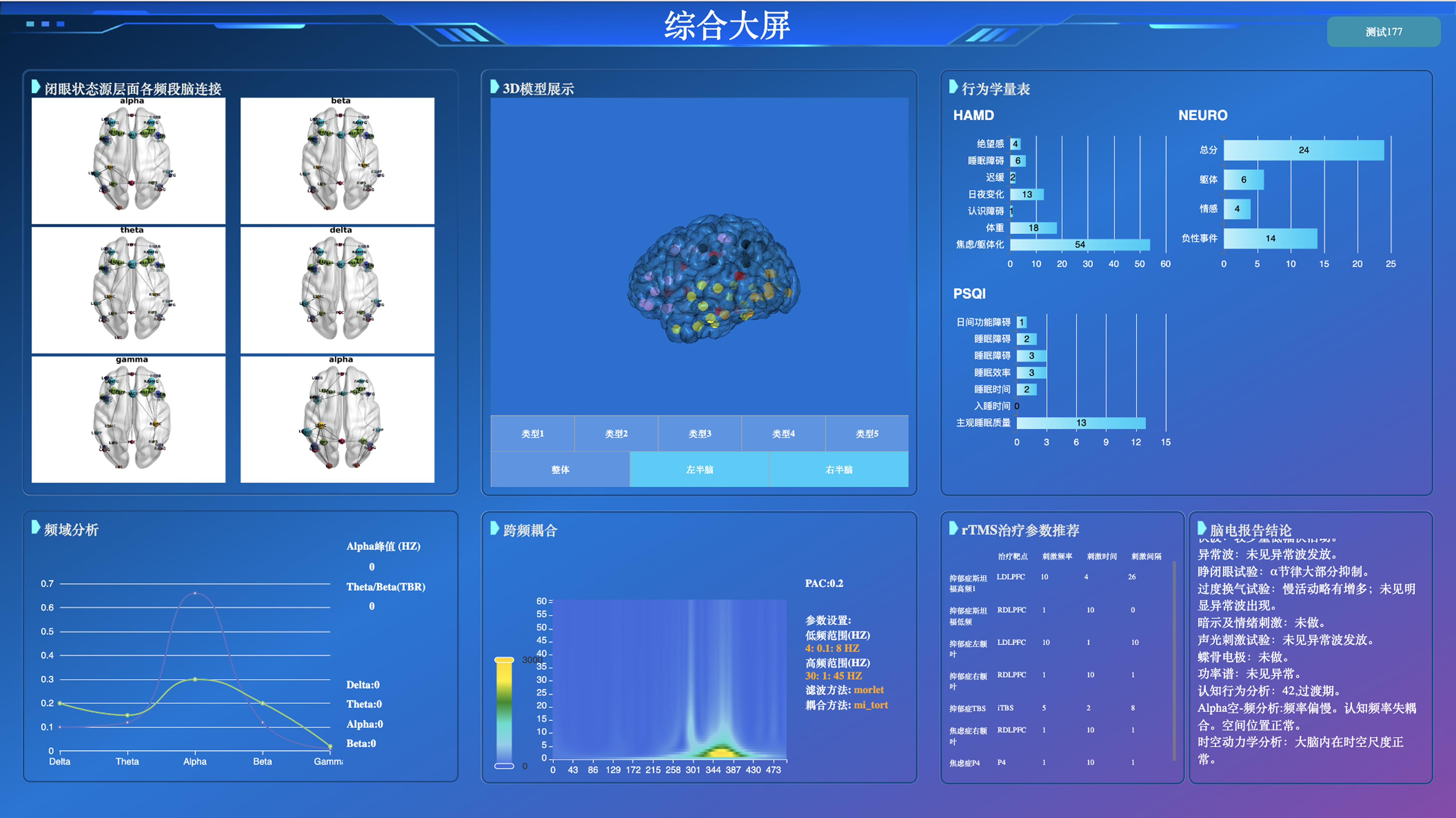
Before → After: The original interface was functional but visually noisy—dense panels, unclear hierarchy, and a generic UI feel. The redesign reframed the product into a disciplined Dark Cockpit system where contrast, spacing, and active-state logic communicate control and readiness.
Dashboards represent credibility.
Shenzhen People's Hospital runs national TMS training programs where clinicians rely on real-time data to verify stimulation targets.
This interface is part of a critical medical workflow—clarity and credibility directly dictate user adoption and safety.
The demo worked, but didn't feel safe.
Over two months, the functional prototype was rejected three times by stakeholders who found it "cluttered" and "unprofessional."
They hesitated to approve it for live patient data because the visual design failed to inspire clinical confidence.
The "Dark Cockpit" Authority System.
I shifted from a generic light theme to a controlled dark palette, directly inspired by medical imaging software and cockpit interfaces.
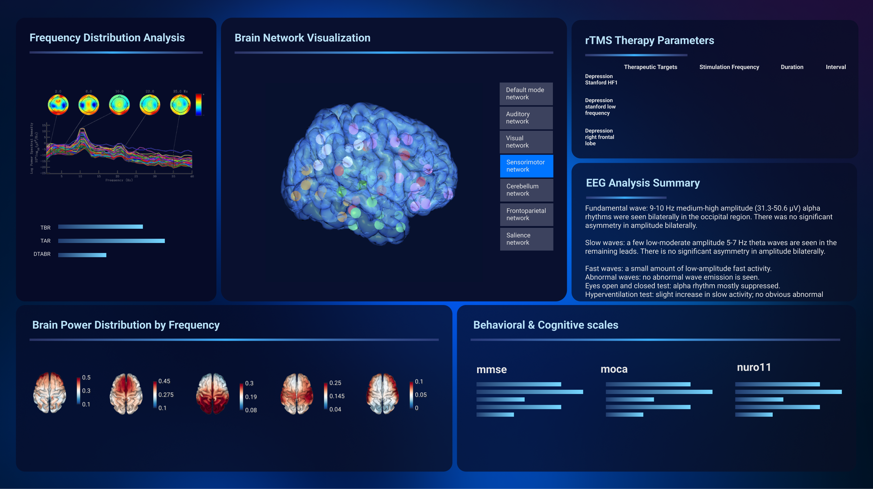
Deep Navy Core
Creates focus, reduces glare, and signals precise technology. Dark environments communicate serious medical authority.
Workflow-Driven Layout
Restructured the dashboard to mirror clinical flow: scan 3D brain, verify parameters, and execute controls.
Rapid Scanning Hierarchy
Electric blue active states and progressive disclosure reduced cognitive load, allowing clinicians to parse data in seconds.
Unblocking the future.
The redesign shifted stakeholder perception from skepticism to confidence, doing what code alone couldn't.
It successfully cleared the path for real-world adoption in national training workshops.
Phase 2
Unblocked and approved for live-data integration funding.
Adopted
Passed vote for use in national training workshops.
Credible
Mentors felt authoritative presenting the system.
More Projects